Visualising inclusiveness and diversity
[[last updated on 23 April 2021 adding articles on ethnic stereotypes]]
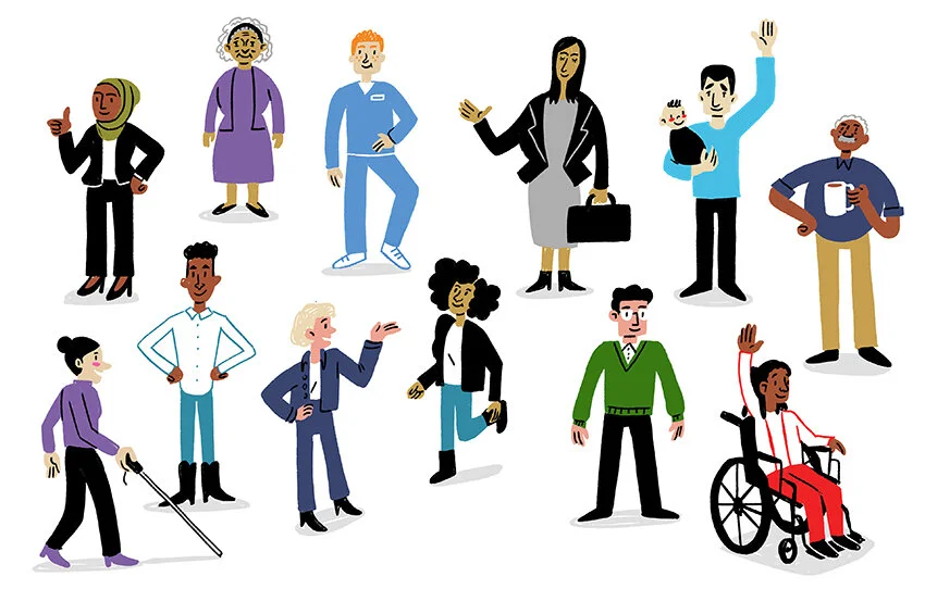
Recently the question about how to sketch diversity and people from different ethnic and cultural backgrounds quite a few times during Q&A after my talks and in my workshops. It is a interesting and important question to raise and one with no quick and easy answer. Like diversity itself, how to represent it is a nuanced question with lots of subtle undertones and hidden assumptions being hidden in how we see and draw 'the other' (or in the worst case, ignore them altogether).
There are a few excellent pieces by fellow illustrators and sketchnoters that explore the topic from various angles showing examples from real projects and what they and their teams learned in the process. If you are interested in the topic, go read the following articles.
Image: Kat Tsai
Image: Malikali Shabazz
Drawing different ethnicities
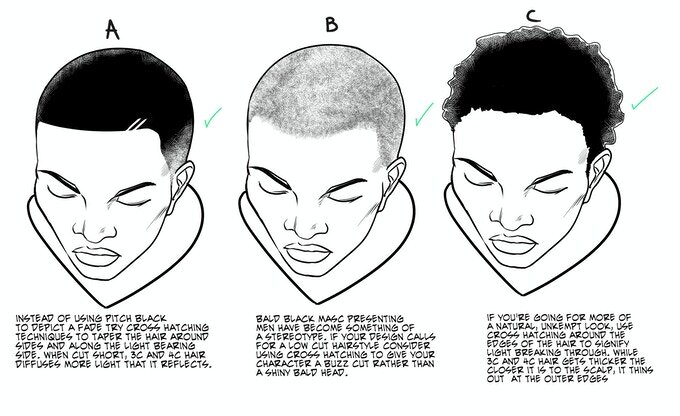
When it comes to drawing various ethnicities (and especially ethnicities that are not ours), it can be difficult to walk the line between representing significant traits and falling into the trap of stereotyping. It’s harder for us to see the nuances in other ethnicities’ faces, so it’s a good idea to sharpen our observation skills and learn from the actual people themselves that we are trying to represent. Here are a few excellent guides to start with:
To avoid ethnically stereotypical and discriminating imagery, it also helps to look into history and learn which imagery has been used before to discriminate and ostracise different groups of people, so we can learn from that and actively avoid these stereotypes:
Diversity Drawing at Ink Factory (And Why It Matters)
A great article about how adding diversity to your drawings means to take a broader and closer look, to change your own biases, to move away from stereotypes and take the time to include variety.
Read Infactory's article
Image: Inkfactory
Inclusiveness in illustration – Designing an inclusive illustration brand for Wordpress.com
In this article Illustrator Alice Lee describes her process of designing a diverse and inclusive set of characters for Wordpress.com that they use for marketing and explaining the sites functionalities. A lot of great considerations about how shapes, colours, lines and other visual elements can subtly shift the story and our perception.
Read Alice's article
You Can’t Just Draw Purple People and Call it Diversity
A very nuanced piece article by illustrator Meg Robichaud about all the challenges and resulting considerations she encountered when building out an illustration style for Shopify. Showing people in your illustrations can bring so much richness to the story, but also adds the responsibility to be empathetic and thoughtful about how you tell this story and depict the people in it. Her thinking goes beyond just body shapes, skin colour and and other physical attributes and includes considerations about how the situations, actions and surroundings you choose convey as much or more about a person and how you view her.
Read Meg's article
Easy ways to show more diversity in your sketches
Ben Crothers, sketchnoter and author of Presto Sketching, makes the connection between diversity and level of detail in your sketches. He gives some practical tips how to add a diversity to your sketches by playing with simple hairstyles, accessories, body shape and posture.
Read Ben's article
Diversity: Drawing people in Sketchnotes
Nadine Roßa, a fellow sketchnoter from Berlin and author of Sketchnotes (only in German), is picking up the idea of playing with different facial and physical attributes and sketching not only different (stereo-)types of people, but actually real people, in all their diversity in appearance, character and circumstances. She also raises the question if it is possible to draw a real 'neutral' person by leaving out as much detail as possible.
Read Nadine's article
Designing inclusive illustrations (or, a brief history of the meeple)
In this article, By Sara VanSlyke, Lead Designer at Atlassian, tells the story of how their illustrations of people and their roles in a team (they call them ‘Meeples’) evolved over the years to include more diversity. It is interesting to see the small steps between iterations and learn about the impact of this process not only on the final illustrations but also on the general conversation on what diversity means for the company and their clients. (Thank you, Molly for the hint to this article)
Illustrating inclusive communities
Damien Terwagne, Brand Design Manager at Airtasker, describes their approach for visualising inclusiveness through illustration in Airtasker’s product and marketing. Besides representing different ethnicities, cultures and genders, the team also considered aspects of inclusiveness like addressing stereotypical beauty standards and paying attention to how social interactions are shown.
(Thanks to Buzz Usborne for pointing me to this article)
How Visual Practitioners Listen for Diversity: tips from the field
This article goes a step further and not only looks at how to visualise diversity, but also how to listen for diversity when live recording and how to encourage and record the diversity of perspectives in the room. For this piece Sam Bradd collected diverse perspectives from many experts in the field and shares them nicely structured by topic.
(Thanks to Nancy for the hint and to Brad for sending me the link)


