Making of… the 'Romeo and Juliet' diagram and animation
This is part 2 of an article about explaining the story of ‘Romeo and Juliet’ visually. You should read part 1 for context and to see the final video.
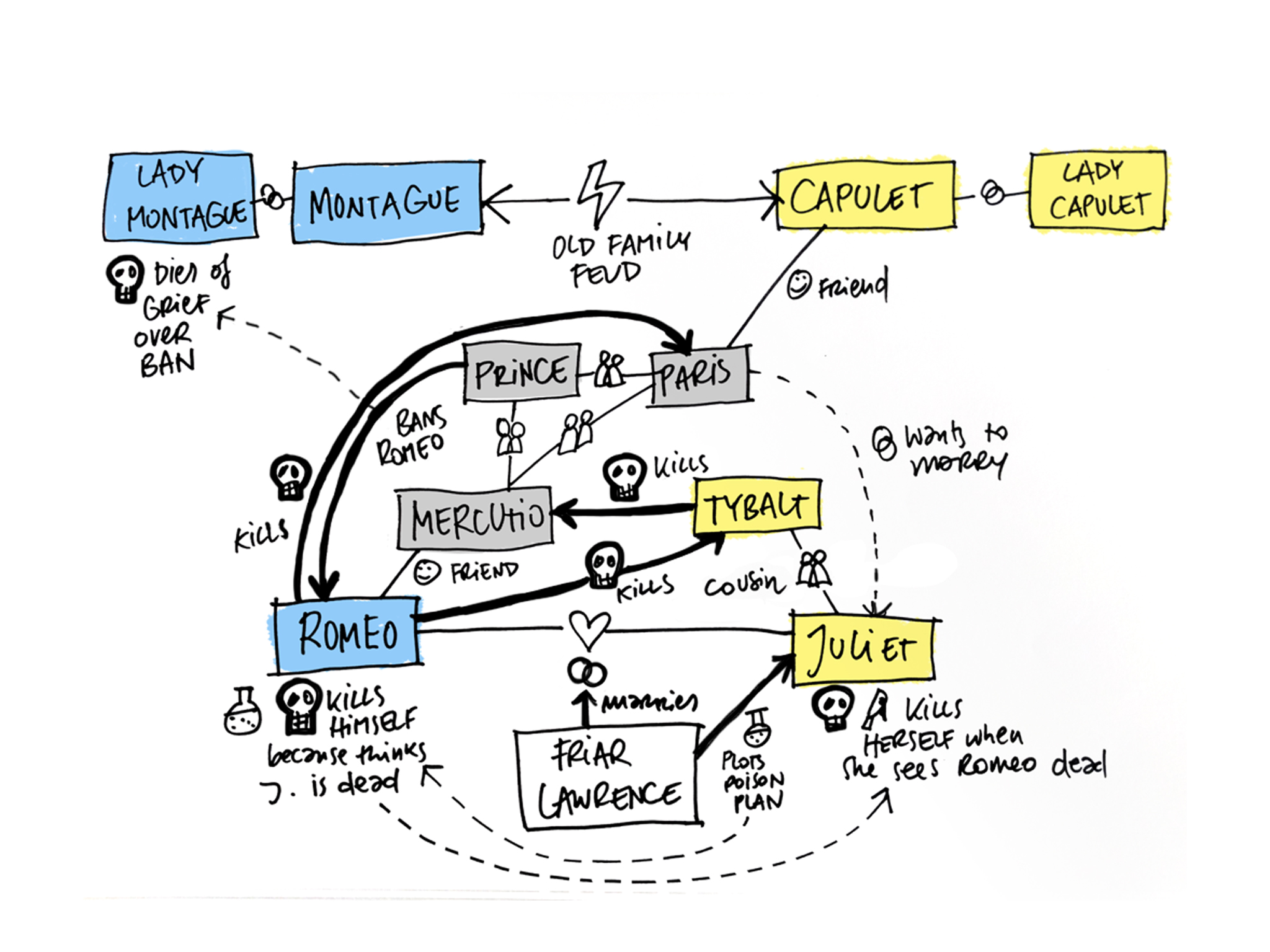
The first version of the diagram (on the left) was done simply with pen on paper. I scanned the sketch and just added the colour for the two families afterwards in Photoshop.
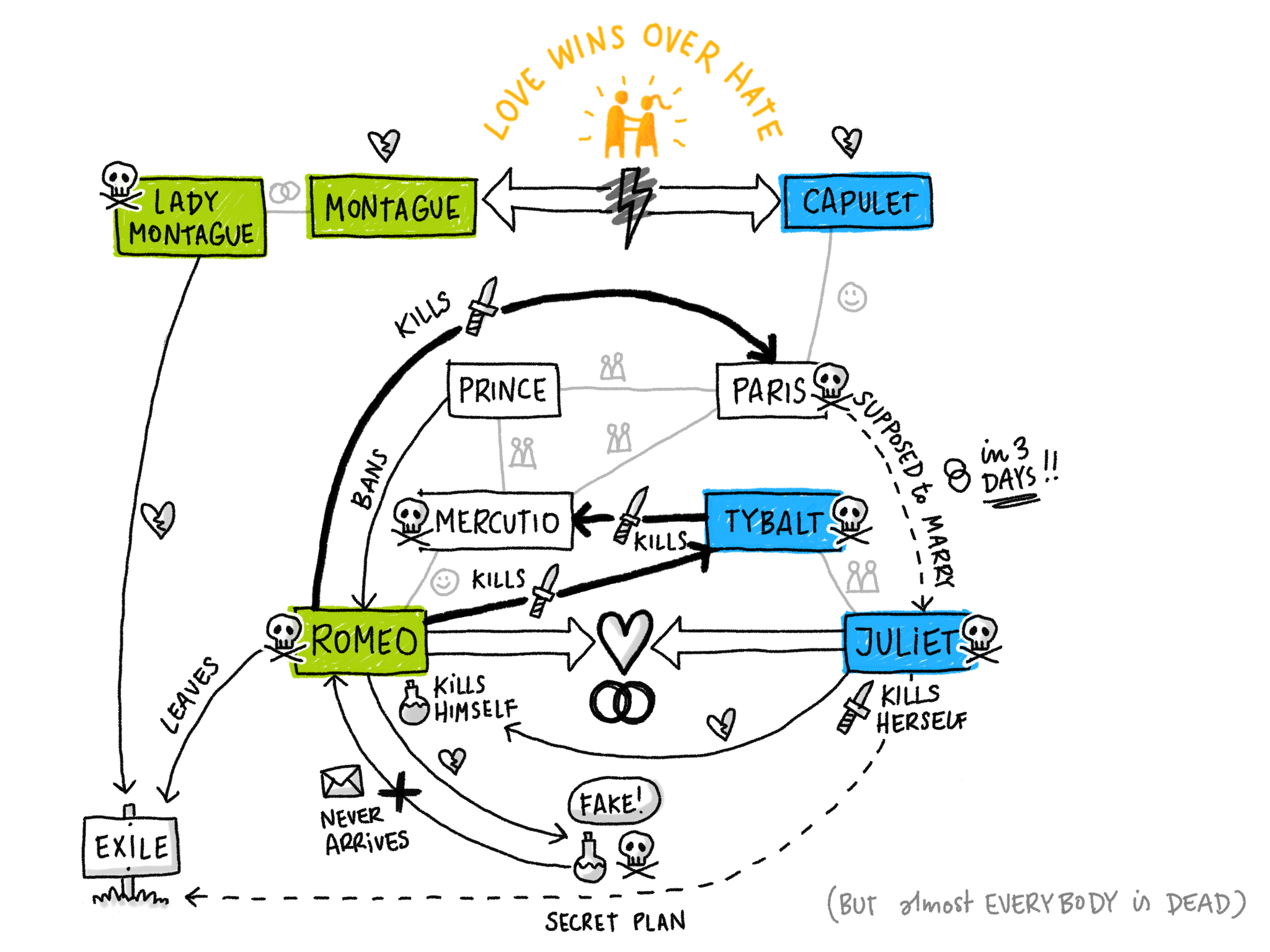
As I wanted to do the second version (on the right) as a step-by-step build-up, I decided to draw it digitally. This makes it easy to separate each step of the build up while having the possibility of making changes in the layout easily.
Version 1 – Drawn on Paper
Version 2 – drawn digitally in procreate
Making a rough layout sketch
I started by making a rough layout sketch for version 2, refining the layout and determining in which order I needed to add the different elements. I used the app ‘Procreate’ on the iPad. Another benefit of drawing digitally is that in Procreate the drawing automatically gets recorded as a time-lapse video, so you can actually see how this first sketch was done:
Refining positioning and connections
The rough sketch (on the left below) solved most of the layout questions, but I wanted to refine the overall shape of the diagram by getting the position of each character spot-on and by refining the curves of the connections between the items. I wanted the network of interactions between the characters to be as visually calm as possible and to roughly fit into a circle so it would be easier for the eye to follow the lines.
The rough Layout Sketch
Straightening out positioning and connections in illustrator
To achieve this, I imported the rough sketch into Illustrator and then placed the characters as boxes on top. Using Illustrator’s alignment features it’s easy to harmonise the distances between the elements and and align them symmetrically. I added the connections between the characters using circle segments and straight lines. Being able to quickly shift and resize each element (as a vector object) helped me to establish the visual balance between the objects that I wanted to achieve.
The clean-up drawing
I exported my Illustrator layout as a JPG, imported it into Procreate, set the opacity to about 20% and used it as guide for the final drawing of the diagram. Here’s is the time lapse video:
I actually drew every element on a separate layer in Procreate so I could easily create the different build-up stages of the diagram by successively turning on the layers one by one.
I exported the drawing as a Photoshop file from Procreate and did export of each individual step in the build up from there (as Photoshop gives a bit more control of the image format and quality than procreate does.)
Drawing layer by layer in procreate
layered file in photoshop
Animating the sequence (live)
The final sequence consisted of 40 images, each adding a small element to the diagram. To keep the narration quick and flowing, I wrote a condensed script and divided it up to fit with each of the steps. Initially this sequence was just meant to be a live performance as part of a conference talk, so I just places each graphic on a keynote slide that I could flick though while telling the story.
All the steps as individual files
building my sequence of slides in Keynote using the speaker notes to remind me of the narration for each step.
The audience feedback for this animated build-up of the story was even better than for the static version. I have used it in three talks so far and many people have told me (in person and in many tweets) that they particularly loved this part of the talk. I’m chuffed that this example and this format really seems to highlight the power of visual structure, especially because the diagram itself is fairly simple, mainly using boxes and arrows – something that even people who think they can’t draw can achieve.
Animating the sequence (as a video)
To share this story (both Shakespeare’s tragic love story as well as the story of the power of visuals) with a wider audience, I decided to also make a video version (which you can watch in part 1 of this article if you haven’t already) . The process was pretty straight forward. I read out and recorded the script as one audio track. I then imported the audio track and the image sequence into iMovie and adjusted the length of each frame on the timeline to fit with the narrative. A bit of light jazz underneath. Done :)
If you enjoyed the video (and this article), please share it with someone who might enjoy it as well.


