
Romeo and Juliet – Explained visually in under 3 mins
I regularly teach and speak at conferences about visual thinking and the power of simple visuals and diagrams to explain even pretty complex stories or problems. As I prefer ‘showing’ over ‘telling’, I created an example: a visual explanation of probably the most famous (and tragic) love story there is in western literature: Shakespeare’s Romeo and Juliet.
Here is a video of a narrated version, explaining the story visually in under 3 minutes.
If you are interested in my process of making this video, read on afterwards.
youtu.be/PPQapzi6lO0
Why visualising Romeo and Juliet?
I developed the first version of this diagram in 2017 for a keynote talk about ‘Visual Literacy and Visual Fluency’. I needed an example to demonstrate how visual structures can help to get an overview over fairly complex systems, to understand relationships and to remember a complex story. I wanted to show an example that everybody in the audience could relate to, because they were (at least somehow) familiar with the topic.
The story of Romeo and Juliet was an ideal candidate. As it is one of the most iconic pieces of western literature, most Europeans have either read it in school, seen it as a movie (like the pretty successful 1996 version by Baz Luhrman starring LeonardoDiCaprio and Clare Danes) or at least had some notion of the story as a commonly used cultural reference.
Complexity
The story was also right in terms of complexity: What most people remember about the story is that Romeo and Juliet fall in love and at the end they tragically die. But usually the how, the why and all the intricate connections and interactions between the characters in the play are hard to recall and fade in our memory.
Structure
The play also contains some strong structural elements that make it a good example for a visualisation: There is the strong duality between the two families Montague and Capulet. They are opponents in a long-standing fight. There is the central theme of the love between Romeo and Juliet, that connects the two main characters, and also stands in direct opposition to the family conflict. And there is an interesting web of relationships between the characters and a recurring theme of killing and death caused by the tension in those relationships.
The first version
Below you can see the first version I drew of the diagram. Well, I actually did a couple of sketches prior to this one to figure out the arrangement, but I can’t find them anymore.
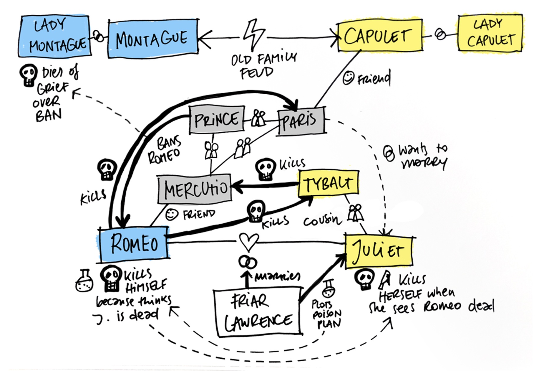
The conflict between the Capulets and Montagues is looming over the whole story. Their duality is expressed by placing the characters of both families on opposite sides of the diagram and adding additional emphasis through using different colours. The love relationship between Romeo and Juliet sits in the center and all the action (mainly killing) unfolds around this relationship as a series of lines and arrows.
Positive feedback
This was the version I used for the first talk. I just showed it relatively shortly on one slide, taking a minute or two to point out the most important points in the story plot. The audience really seemed to like the diagram and the feedback from several people was that the ‘Romeo and Juliet’ story was one of their favourite parts of the talk. It seemed like I was onto something.
Refining the diagram
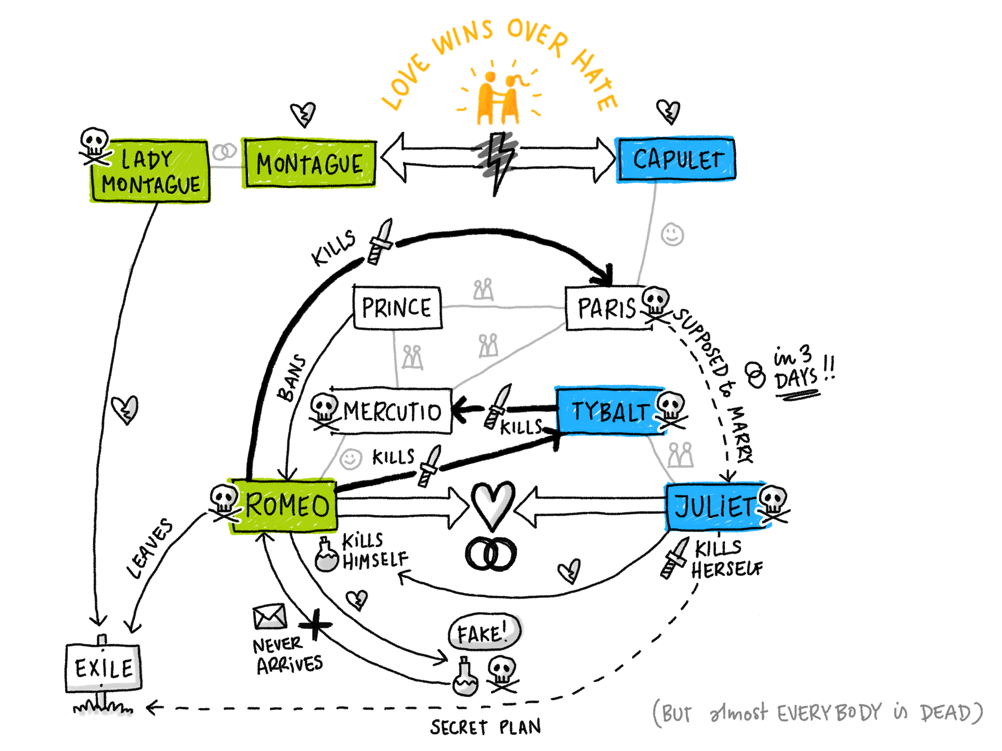
As the diagram turned out to be a good way to illustrate the benefits of visually summarising a complex story, I kept using the example. I had made the first version relatively quickly and after re-telling the story several times, I wanted to refine the diagram and visually sharpen some of the structural concepts so they’d be easier to see at first glance.

In this 2nd version of the diagram, I applied a bit more nuance in the treatment of the connections between the characters.
Key relationships
The key opposing relationships – the feud between the families and the opposing force of the love connection between Romeo and Juliet – are treated as strong wide arrows with clear opposing directions that set the basis for the unfolding tragedy.
Additional Relationships
I paired back the visual strength of descriptions of additional relationships (like being married, friends or cousins) by making the lines a lighter grey. These relationships give context to the actions but don’t need to have the same visual weight.
Action patterns
I also wanted to emphasize the pattern of killing and death.
First, I marked all characters that eventually die got with a skull. I then made all arrows that signified a killing bolder and therefore visually stronger. To indicate the way somebody is killed, I used simple icons of a dagger (for stabbing) and a little bottle (for poisoning).
Adding the dimension of time
The diagram works great when you know the story. It contains all the key characters and events that help you remember the story’s details. But when you see the finished version for the first time without someone guiding you through it, it can be hard to decipher what happens first and how the story unfolds step by step.
I decided to experiment with making a step by step build-up of the diagram that allowed the viewer to experience how the story unfolds over time and how each interaction between the characters adds a layer of complexity until the full story is laid out in front of them.
Below is a timelapse video of my iteration sketch where the order of drawing starts to reflect the order of events over time.
Adding the element of time also gave me the opportunity to show the resolution (and moral) of the story as a last layer: In the end the two patriarchs decide to finally end the feud – which is nice, but also seems quite ironic and a bit too little too late considering all the deaths that had to happen… But at least, love does conquer hate (somehow) in the end.
If you are interested in the technicalities of making the final diagram and animation, here’s part two of the article, talking about tools and process.