How to visually document a Design & Innovation Workshop
Bringing together over 80 designers from different locations around the world for 3 days to meet face-2-face, exchange and work on a design challenge creating ideas for future innovation is an intense experience.
How can you document such an event, so that the ideas, conversations and results can live on beyond the event and be shared with the participants and spread within the wider organisation in an engaging way afterwards?
I recently got invited by HERE Technologies to help exactly with that, by creating digital sketchnotes during their 2018 Design Summit in Berlin.
Photo: HERE
HERE is a leading mobile location platform providing mapping and location data and services, enabling the development of innovative products in areas like navigation, transport & logistics, smart cities and infrastructure.
The topic of their design summit was the future of autonomous technology and it was divided into 3 days, each with a different format and focus.
Day 1 – Inspiration day
Day 1 was all about inspiration and exchange.
Throughout the day, talks and demos were presented by different teams, showing the latest trends from their field and recent work and prototypes. The topics ranged from data collection, visualisation and mapping technology to current research, design and development practices.
Photo: HERE
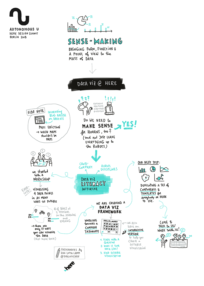
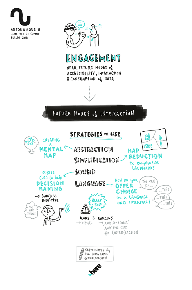
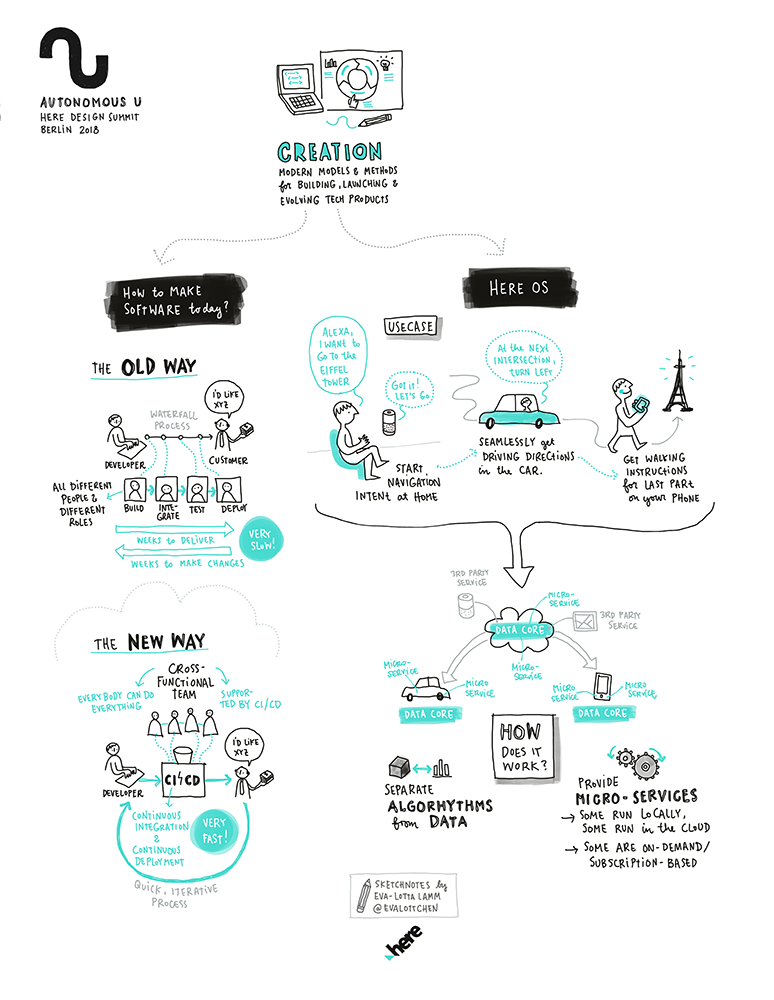
I captured the content of the talks live in digital sketchnotes.
Digital sketchnotes are great, because they make it easy to edit and re-structure the content after the talk. Like that, the live captured material can be shaped into a well-rounded visual summary with just a small amount of extra work at the end.
I shared the summaries of all the talks with the organiser at the end of the day and they were ready to be used the next morning in the re-cap presentation of Day 1.
Another advantage of the digital format is that the different parts and individual thoughts can easily be extracted visual snippets and used separately in different formats, like internal communication or presentations on a particular topic.
The sketchnotes are vector based and can be exported as high-resolution files, so they can be used in any size, from small illustrations in a powerpoint deck to billboard-sized posters.
If you are interested in my actual set-up and the technical details of sketchnoting digitally during the event, please check back for part 2 of this article “Digital sketchnoting at the HERE Design Summit – behind the scenes”, which I'll publish here next week.
Day 2 – Workshop day
On day 2, everybody got to work.
The attendees got divided into groups, each with a different focus area, to work on ideas for the Smart City project in Dubai. Each group worked through a mini design-process, from brief and research input to ideation and development of a pitch for presentation the next day.
Photo: HERE
My role during the day was to capture the process and document how people work together.
I spent some time with each of the groups observing their process and eavesdropping on their conversations. I also did some short interviews with various attendees to get their thoughts on how they approach the design process. For that, the organisers and I had agreed beforehand on three questions to explore:
How can we use our outside perspective to help the problem solving?
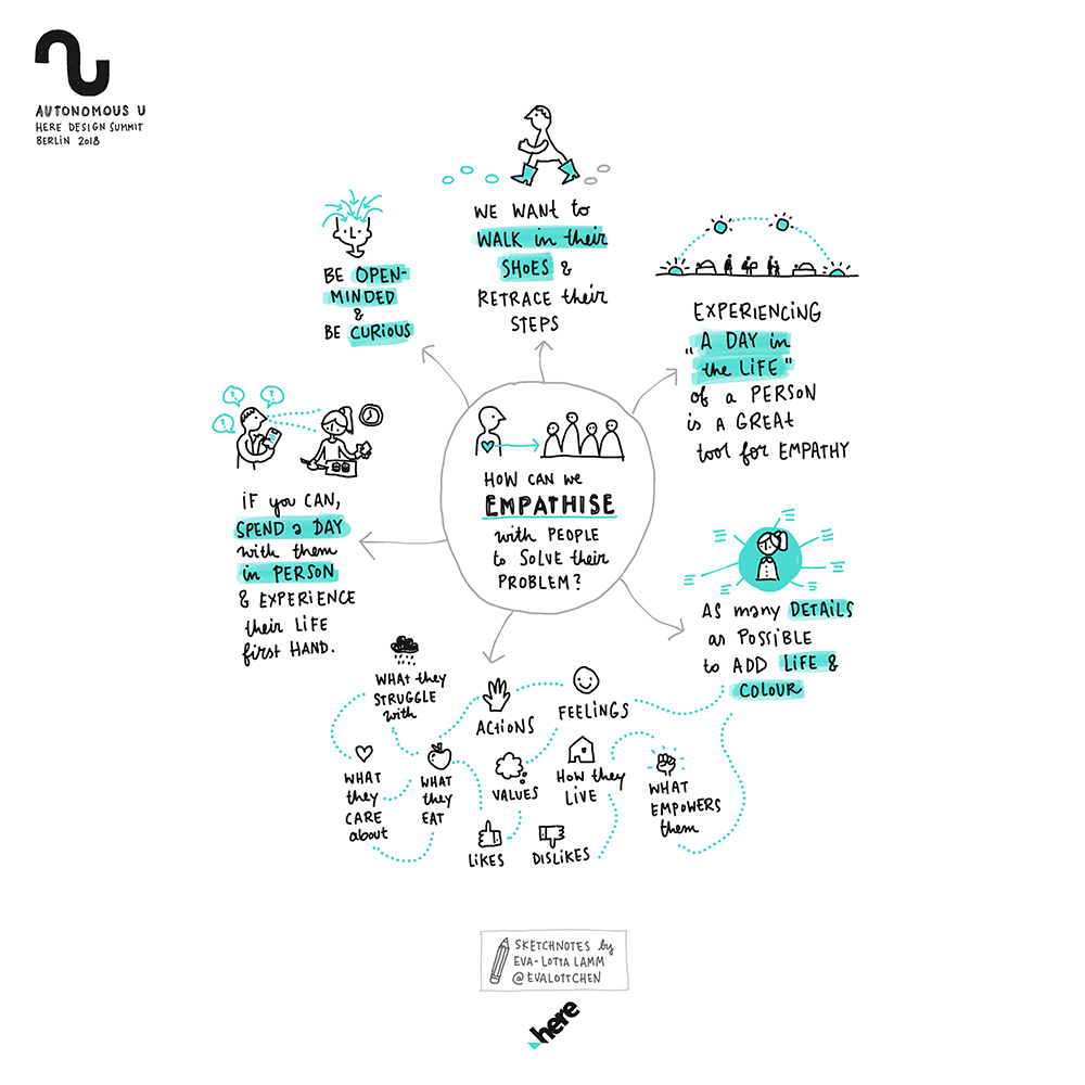
How do we empathise with users to solve the problem?
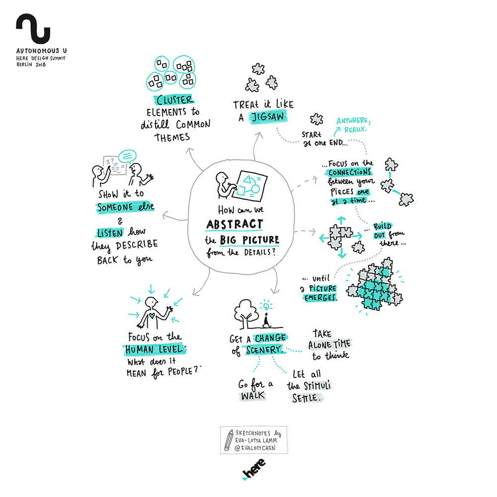
How do we get to the big picture from all the details?
To keep the interviews light and fun for people in-between the intense working phases, I sketched out each question on card, and treated the interview like a little game, turning over the cards one by one, asking people to give me their first thoughts on the topic.
I had a lot of really lovely little conversations and based on my notes, I summarised and visualised all the different perspectives by the end of the day. In addition to the actual results that were to be presented the next day, the interview sketchnotes were a nice way to also highlight design as a process and the difficulties and considerations that it contains.
Day 3 – Results day
On day 3 it was back to presentations and classic live sketchnoting of the concepts each group had developed and presented on stage.
In addition to the slide decks and the videos that were filmed of each presentation, the sketchnotes give a nice one page overview for each concept that can be consumed at a glance.
The different groups that presented on day 3
Post-event wrap-up and feedback
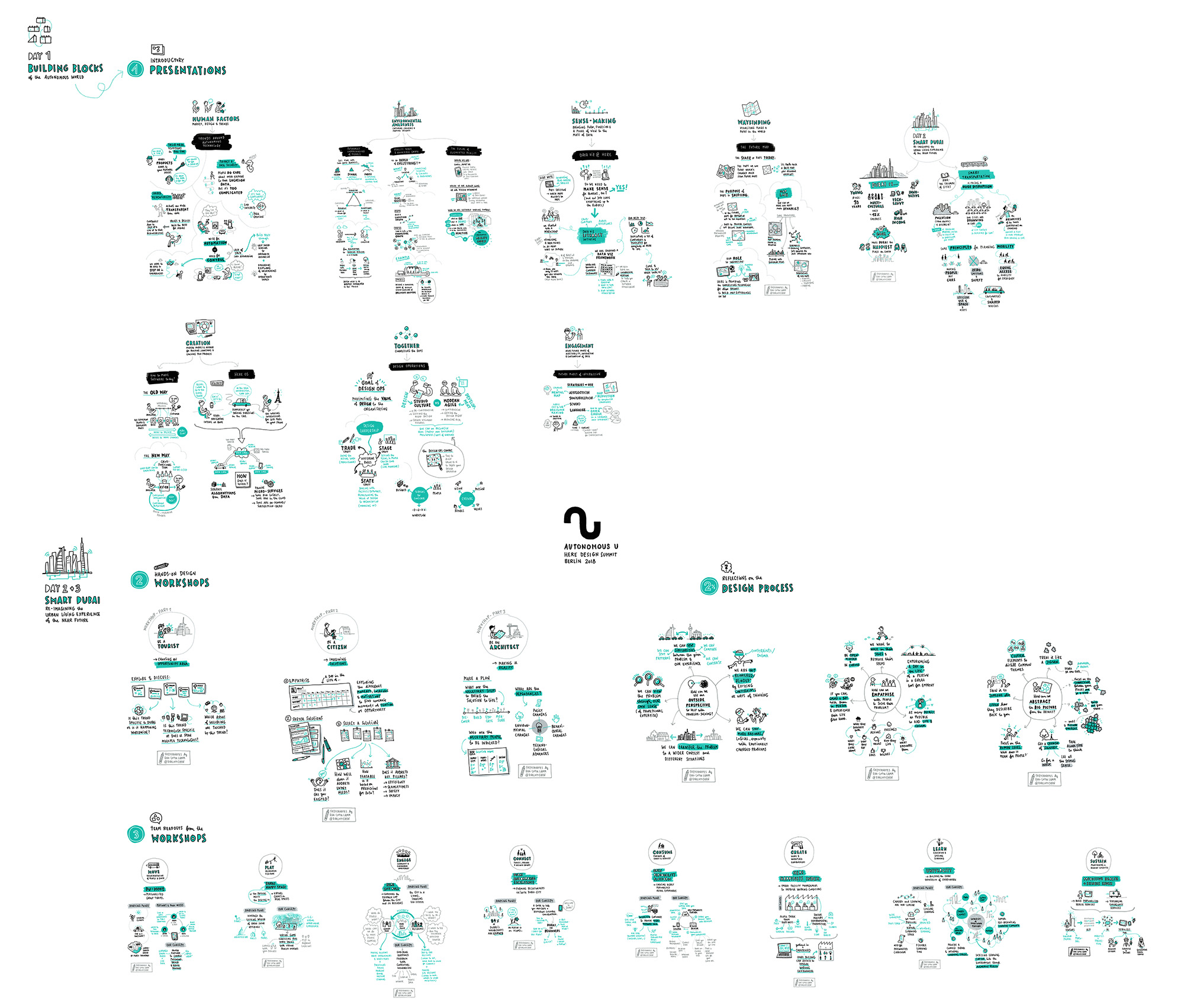
After the event, I delivered a series of high-resolution sketchnotes to the client, one for each topic. It is always impressive to look back at the wealth of knowledge, ideas that can be produced in such a short amount of time. And being able to share and access this valuable content in a friendly and engaging format of visual notes helps to amplify the impact of an event like this – way beyond its duration and the group that was attending.
Or to say it with the words of J F Grossen, HERE's Global VP of Design: “Our content and discussions covered a wide spectrum and tangled mesh of both consumer and expert systems technologies, processes and tools. Eva-Lotta was able to bring clarity and focus and a human interpretation. An amazing body of work that we will be referring to for some time to come.”
What about your event?
If you are interested in having your event documented with sketchnotes, you should get in touch so we can talk about your requirements.
The complete set of sketchnotes produced during the 3 days
