
The Power of Re-Ordering
Turning sketchnotes into more robust summaries with a two-step process
Some of the questions I get asked most often about sketchnoting are:
“How do you structure the space you work with? How do you know where to put things? How do you make sure you don’t run out of space?”
The honest answers is: I don’t know in advance and there is no way to fully control the structural aspects of a live sketchnote or graphic recording. As I don’t know in advance which content is coming, it is always a dance with the unknown and a process of improvisation.
Creating structure in the unknown
There are a few effective strategies for working with the unknown that rely less on spatial arrangement and more on creating visual coherence, contrast and hierarchy through styling the written and drawn elements you add to the page.

By using size, contrast, colour, style and structural elements, we can visually unify information at the same level by applying similar styles. We can make key points and topics stand out through adding more contrast and using stronger visual treatment. The strong visual hierarchy we create helps the eye to find key points first and discover more detail in a second step.
The actual placement of the elements is an informed guess based on the content that is already there. I’m calling this approach ‘micro structuring’.
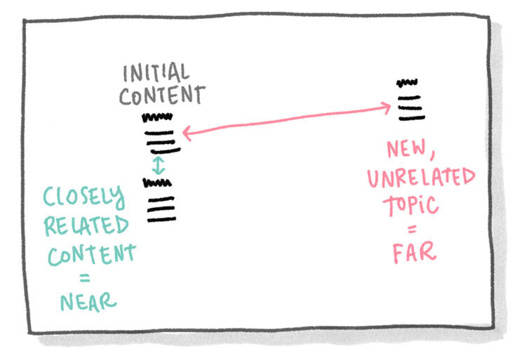
Instead of deciding on one big overall structure to hold all of the content to come, I create a structure bit by bit as new content arrives, always evaluating where the new content fits in relation to what is already there: Details for an existing topic are placed closely around the key word, a new but related topic is placed a bit further away and a completely different different topic will open up a new space on a different part of the page. Through these micro decisions an organic structure for the content emerges little by little.
In most cases, this structure works reasonably well and is understandable for people who were in the room and witnessed the original discussion or talk as well.
Turning collections into summaries

To create a more robust version that can stand on its own as a self-explanatory summary of the content, you might want to make a round of edits though to re-order the content and add additional structure.
This approach will make the content more accessible and is particularly useful if you want to use your sketchnotes to summarise a debate or a workshop for a wider audience or preserve the information over a longer timespan when the context and memory of the actual event is not present in people’s minds (anymore).
You think of your visual overview as giving your reader a guided city tour rather than just handing them a map and let them wander off by themselves: it should provide starting points for the reader, show clear sections for different topics and indicate a reading order.
I use 4 main strategies to get from a live collection of notes to an edited structured summary:

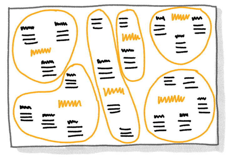
1. Clustering: Finding all elements that belong together.
Depending on the purpose of the summary, these clusters can be by topic (which is the most common), time, person, type of content, importance or any other attribute that seems suitable to divide the information into groups.
2. Labelling: Finding a strong keyword or title that describes the cluster.
Good summarising titles with strong visual contrast next to the content groups become an easily scannable index for the whole piece that enables the reader to get an overview and find content quickly.
3. Ordering: Choosing the right spatial structure for the content.
There are three main types of structures I use as starting points when ordering content:

Systems:
Systems consist of nodes and relationships. They are great when you have a topic with different subtopics and related information. Systems are like mind maps where related information is connected either by lines or by being placed close together. Systems work best when we need to break down a topic into different aspects and explain which parts it consists of.
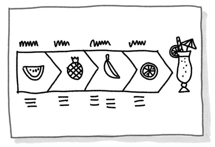
Processes:
Processes show a step-by-step development. They have a clear starting and end point. They can be visualised by a path that the information is arranged along. The shape of the path can be straight, curved, circular, in loops or in steps – depending on the quality of the progress of the content. Processes are great to tell stories or to explain how something is done.
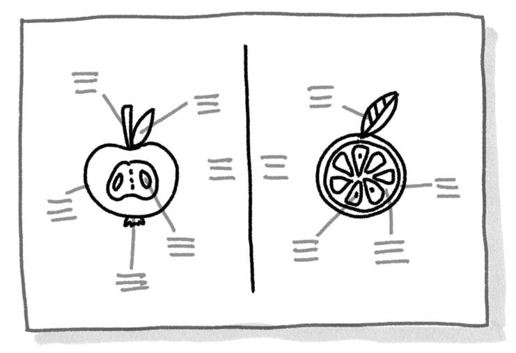
Comparisons:
Comparisons show similarities and differences between two (or more) items. They are most powerful when the information that is compared is shown next to each other and with some similar visual structure, so it becomes easy to see which parts are similar and which parts differ. Some typical cases for comparisons are showing ‘X vs. Y’, ’Pros and Cons’ or ‘Before / After’.
These three types are just starting points that can be refined and remixed. I often end up with several structures combined into one big image as different parts of the content ask for different structural treatment.

4. Sharpening the visual hierarchy.
Visual hierarchy is key to make your content easily scannable for the eye. The same principles apply as I mentioned earlier in the article.
When I apply visual hierarchy to a summary I focus on answering the following basic questions of a reader through visual means:
Where do I start?
In which order do I read through the different parts?
What are the key topics/sections and where do I find them on the page?
Digital or analogue re-ordering?
Of course it is easier to edit an existing sketchnote in the digital format. Working digitally makes it easy to re-order, change and add elements to the piece. If you did your initial sketchnote digitally: great; you can just start editing. If you worked on paper, you can scan the page and then do the edits in a graphics program like Photoshop, Affinity or GIMP.
You can also go the fully analogue route of taking a pair of scissors to cut up your sketchnote, re-order the content, glue it down and draw a new summarising version based on the collaged sketch.
Examples
To finish, I want to show you three examples from my own work where I used a two-step approach of first collecting and then restructuring content.
Graphic recording workshop sessions at Creative Bureaucracy Festival
Small notes during the session
Summarised big version
For this event my co-recorder Claudia Steiner and I decided to record the session in a two-step process because they all contained some workshop element with group work and audience participation that we needed to work into the recording. During the sessions, we listened and collected content from throughout the room in a small format and made a summarising recording on a big wall after each session.
Live digital graphic recording of public discussions
I was invited to live capture a public discussion on the problems and needs of the cycling routes in my home town of Tuttlingen in southern Germany. I created a live digital recording that was projected for everybody to see to support the discussion while it was going on. It was an open discussion with no prepared structure, so the live version was a big collection of different viewpoints with just some visual hierarchy applied to make it easier to see the key topics and questions the debate touched on. In a second step I created a structured summary that could be shared with the wider public and could serve as a basis for further meet-ups and working groups.
Live collection during the discussion
Structured summary done after the discussion
I used the same approach at a recent discussion at Google GovLabs about the risks and opportunities of digital platforms for participation processes.
Live collection during the discussion
Structured summary done after the discussion
Digital sketchnoting of a conference talk at Away Days Berlin
In this example, there is a fairly fluid transition between collecting content and re-structuring it. The latter actually didn’t happen after the session but while it was still going on. This fluid way of switching between capturing and editing is easy and quite efficient when working digitally.
But beware: the temptation start editing too early and too much is big. Give yourself at least the full first half of the talk to properly listen and capture a good amount of information and only move to a more editing mindset in the last 3rd of the session. Otherwise you’ll end up with nothing or very little content to structure. When you are just starting your sketchnoting journey it is better to strictly separate the process into the collection phase (during the session) and the re-structuring (afterwards) so you don’t fall into constant-editing trap.
Happy collecting and re-ordering!