The joy of doing ‘ugly’ sketchnotes
I’ve been doing sketchnotes for well over a decade now. I’ve sketched 100s of talks. Most of them just for myself. I actually only did about a couple of dozens of paid sketchnotes or graphic recording jobs where I sketched live for other people.
Some of my early sketchnotes
So you should think that when I am mostly sketchnoting just for my own benefit, I shouldn’t feel too much pressure to do ‘a great job’ every time. But of course, that’s not the case. I also fall victim to the voice of my inner judge, telling me that the final product should look good and well structured and impressive and ‘perfect’ (whatever that means). And of course, sharing most of my sketchnotes online adds to this expectation.
Wanting to do something well is not a bad thing, but these high expectations I (consciously or unconsciously) have for the final product can actually get in the way of doing ‘good sketchnotes’.
And with good sketchnotes I don’t mean ‘visually impressive’, but sketchnotes that support my listening and understanding, that help me engage in the content, that bring me joy while creating them, that capture the points that truly interest me and that allow me to widen my comfort zone and my range of (visual) expression.
When I am too concerned about what the final sketchnote will look like it can compromise my listening:
I might concentrate more on drawing something nicely than listening to the next points that follow.
I might skip capturing a point because I’m still drawing something else or because it doesn’t fit on the page nicely and might disturb the structure I already established.
I might shy away from drawing something ‘difficult’ or something that I haven’t attempted drawing before, choosing a simpler image instead, so I don’t mess up my sketchnote with an ugly drawing.
I might capture less altogether because I write and draw at a slower pace so the notes look neater.
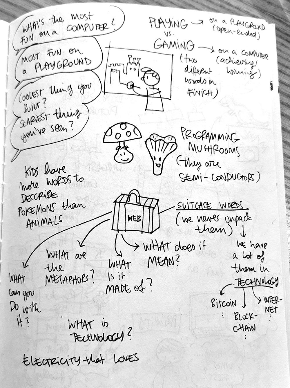
Although I try to not let expectations limit or alter what I do, it still happens. So every now and then it is good, to consciously break out from these expectations by allowing myself to do ‘ugly’ sketchnotes. To just use a simple black pen in a small notebook with thin pages (with the drawings from the back of the page shining though), knowing I won’t show or share these notes, allowing myself to rush, to make mistakes, to cross things out, to write sloppily, to make wild and ugly drawings, to not care about structure or visual hierarchy, to ignore consistency, and to just relax and do whatever happens.
I had the opportunity to do such sketchnotes recently. I got hired by Wacom to help them demo their big Cintiq tablet at their stand at Beyond Tellerrand Conference in Düsseldorf (which is an excellent web design and creative conference you should attend. The next edition is this September in Berlin.)
My sketching set-up at the Wacom stand
The idea was to listen to the talks and then use the breaks to draw some of the key points on the big tablet so the conference-goers could watch me draw, ask questions and try drawing themselves on a second tablet.
View from my little sketchbook during a talk
In order to capture the content I could then draw in the breaks I took a cheap little MUJI sketchbook and a simple rollerball pen and collected some interesting nuggets of each talk as rough and ugly sketchnotes.
And it was a lot of fun! I had forgotten how freeing it is to just go let go and not worry about how my sketchnotes would look in the privacy of my secret notebook that nobody else would lay eyes on.
Above: The pages from my secret sketchbook. But…shhhhhh….
Besides being freed from concerns and expectations while I listened and took notes, there were a few other nice side effects:
I was more open to play and experiment.
I could draw various images for the same piece of content. If I had several ideas for how to visualise a point, I could just draw them all. Or I could redraw an image a couple of times to get it right or to refine the concept.
I didn’t have to be focussed on placement, space, order or structure and could concentrate on listening to the content and developing images.
I could be fully present in the moment, listening to the current point the speaker was making without having to keep the big picture in mind, without having to consider where a point sits in relation to what came before and without worrying what or how much might come afterwards.
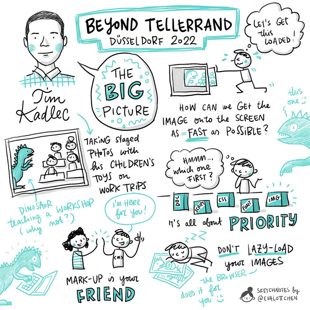
After each talk I used my ‘ugly’ collection of notes and image ideas, pick the most salient ones and draw a ‘pretty’ summary on the big tablet – without time pressure and using a digital tool that allows for easy correcting, editing, layering arranging and reordering elements.
Above: The final summary drawings
And this part was a lot of fun, too. It felt relaxed and easy to just focus on picking my favourite pieces of content, drawing a visually pleasing version of image ideas I developed earlier and being able to use all the advantages drawing digitally.
Although I like the challenge of sketchnoting live, I really enjoyed this two-step process and the reduced pressure that allowed me to play and experiment more. I re-discovered the joy of just sketching in secret every now and then without worrying about making it good or pretty or well structured.
If you are interested in more benefits of a two-step sketchnoting process, check out this blog post about the power of re-ordering I wrote a while back and this behind-the-scenes story of a live discussion I visualised and re-ordered afterwards.
And now go grab your secret sketchbook and enjoy drawing something that you’ll never show to anyone :)


